Icaro
Icaro
Redesigning an educational platform to build clarity & trust
Redesigning an educational platform to build clarity & trust
CLIENT
CLIENT
CLIENT
Icaro
Icaro
Icaro
PROJECT DURATION
PROJECT DURATION
PROJECT DURATION
12 weeks · 2023
12 weeks · 2023
12 weeks · 2023
SERVICE AND OFFER
SERVICE AND OFFER
UX Research
UX Research
UX Research
Information Architecture
Information
Architecture
Information Architecture
UX/UI Design
UX/UI Design
UX/UI Design
TOOLS
TOOLS
Figma
Figma
Figma
Photoshop
Photoshop
Photoshop
Illustrator
Illustrator
Illustrator
PROBLEM
PROBLEM
PROBLEM
Icaro is an EdTech platform based in Córdoba, Argentina, offering certified online training across tech, business, and digital skills. Backed by the National University of Córdoba, its mission is to make quality education more accessible for students and professionals.
Icaro is an EdTech platform based in Córdoba, Argentina, offering certified online training across tech, business, and digital skills. Backed by the National University of Córdoba, its mission is to make quality education more accessible for students and professionals.
Icaro is an EdTech platform based in Córdoba, Argentina, offering certified online training across tech, business, and digital skills. Backed by the National University of Córdoba, its mission is to make quality education more accessible for students and professionals.
MY ROLE
MY ROLE
MY ROLE
As the lead UX/UI designer, I was responsible for understanding user pain points, restructuring the platform’s information architecture, and designing a new responsive interface that would feel simpler, more trustworthy, and easier to explore.
Throughout the process, I collaborated closely with the product manager and developers to validate decisions early and align expectations across the team.
THE CHALLENGE
THE CHALLENGE
THE CHALLENGE
Despite offering great content, the website didn’t reflect the platform’s credibility. It was dense, slow, and difficult to navigate. Many users felt overwhelmed, unsure about what each course offered, and where to begin. This lack of clarity and guidance led to hesitation and low engagement.
Despite offering great content, the website didn’t reflect the platform’s credibility. It was dense, slow, and difficult to navigate. Many users felt overwhelmed, unsure about what each course offered, and where to begin. This lack of clarity and guidance led to hesitation and low engagement.
Despite offering great content, the website didn’t reflect the platform’s credibility. It was dense, slow, and difficult to navigate. Many users felt overwhelmed, unsure about what each course offered, and where to begin. This lack of clarity and guidance led to hesitation and low engagement.
🔍 How might we…
🔍 How might we…
Redesign ICARO’s website to help users feel confident, informed, and motivated to enroll — without overwhelming them in the process?
Redesign ICARO’s website to help users feel confident, informed, and motivated to enroll — without overwhelming them in the process?
Redesign ICARO’s website to help users feel confident, informed, and motivated to enroll — without overwhelming them in the process?
UNDERSTANDING THE PROBLEM
UNDERSTANDING THE PROBLEM
UNDERSTANDING THE PROBLEM
To uncover what was stopping users from confidently enrolling in Icaro’s courses, I led a lightweight but focused research phase. This early discovery helped define priorities and reveal clarity gaps in the original experience.
I combined qualitative and structural methods to get both user and business perspectives:
• UX audit of the live platform
• Short survey for prospective students
• Stakeholder interviews with the internal team
• Quick competitor scan of similar educational websites
This approach helped me identify what users were struggling with, what they expected from the platform, and what needed to change in order to build a more intuitive, trustworthy experience.
I also defined three key questions to guide the research:
1. What makes users hesitate before enrolling?
2. How do they choose a course that fits their goals?
3. What builds trust in an educational platform?
These questions helped structure the findings and reveal what users needed most to feel confident during their decision-making journey.
⏱️
⏱️
⏱️
⏱️
CONFUSING NAVIGATION
CONFUSING NAVIGATION
CONFUSING NAVIGATION
CONFUSING NAVIGATION
Users felt lost in the course catalog and couldn’t find relevant options easily.
Users felt lost in the course catalog and couldn’t find relevant options easily.
Users felt lost in the course catalog and couldn’t find relevant options easily.
Users felt lost in the course catalog and couldn’t find relevant options easily.
🔐
🔐
🔐
🔐
MISSING TRUST SIGNALS
MISSING TRUST SIGNALS
MISSING TRUST SIGNALS
MISSING TRUST SIGNALS
Lack of visible credentials or testimonials made users doubt the platform.
Lack of visible credentials or testimonials made users doubt the platform.
Lack of visible credentials or testimonials made users doubt the platform.
Lack of visible credentials or testimonials made users doubt the platform.
⏳
⏳
⏳
⏳
INCOMPLETE FLOW
INCOMPLETE FLOW
INCOMPLETE FLOW
INCOMPLETE FLOW
People didn’t trust the registration process due to missing info.
People didn’t trust the registration process due to missing info.
People didn’t trust the registration process due to missing info.
People didn’t trust the registration process due to missing info.
📚
📚
📚
📚
CONTENT OVERLOAD
CONTENT OVERLOAD
CONTENT OVERLOAD
CONTENT OVERLOAD
Pages had too much copy, and key details were buried or scattered.
Pages had too much copy, and key details were buried or scattered.
Pages had too much copy, and key details were buried or scattered.
Pages had too much copy, and key details were buried or scattered.
These insights became the foundation for every design decision that followed—shaping a simpler, more credible experience for future Icaro students.
These insights became the foundation for every design decision that followed—shaping a simpler, more credible experience for future Icaro students.
These insights became the foundation for every design decision that followed—shaping a simpler, more credible experience for future Icaro students.
DESIGN DESICIONS
DESIGN DESICIONS
DESIGN DESICIONS
Based on the research insights, I focused on simplifying the platform’s structure and improving clarity—helping users understand the offer, navigate with ease, and feel more confident throughout their experience.
I redesigned the navigation, restructured content into clearer learning paths, and created a UI system that feels intuitive, clean, and aligned with the platform’s academic credibility.
INFORMATION ARCHITECTURE
INFORMATION ARCHITECTURE
INFORMATION ARCHITECTURE
One of the most critical steps in this redesign was restructuring the platform’s information architecture.
I created a new site map that grouped content into learning paths and clarified the navigation flow across key sections—helping users explore courses, understand ICARO’s value, and act with confidence.
USERFLOW & TASKFLOW
USERFLOW & TASKFLOW
To validate the user journey, I mapped the enrollment process at two levels: a simple task flow to outline the steps, and a user flow to visualize decisions and possible errors. This helped ensure the experience would be smooth, intuitive, and aligned with user goals.
To validate the user journey, I mapped the enrollment process at two levels: a simple task flow to outline the steps, and a user flow to visualize decisions and possible errors. This helped ensure the experience would be smooth, intuitive, and aligned with user goals.
UI SYSTEM
UI SYSTEM
UI SYSTEM
To ensure consistency across the new ICARO platform, I created a UI system that reflects the brand’s refreshed tone: clean, modern, and accessible.
Below, I’ll highlight key foundations — from the visual language to the interactive components that shape the experience.
To ensure consistency across the new ICARO platform, I created a UI system that reflects the brand’s refreshed tone: clean, modern, and accessible.
Below, I’ll highlight key foundations — from the visual language to the interactive components that shape the experience.
To ensure consistency across the new ICARO platform, I created a UI system that reflects the brand’s refreshed tone: clean, modern, and accessible.
Below, I’ll highlight key foundations — from the visual language to the interactive components that shape the experience.
BRAND IDENTITY
BRAND IDENTITY
BRAND IDENTITY
I selected the Montserrat typeface and a bold, accessible color palette to reflect ICARO’s renewed visual tone. The combination of bright blues and neutral grays helps convey clarity, trust, and academic credibility across the interface.
I selected the Montserrat typeface and a bold, accessible color palette to reflect ICARO’s renewed visual tone. The combination of bright blues and neutral grays helps convey clarity, trust, and academic credibility across the interface.
I selected the Montserrat typeface and a bold, accessible color palette to reflect ICARO’s renewed visual tone. The combination of bright blues and neutral grays helps convey clarity, trust, and academic credibility across the interface.
LAYOUT & COMPONENTS
LAYOUT & COMPONENTS
LAYOUT & COMPONENTS
To bring clarity and coherence to the platform, I designed a modular UI system that ensures scalability and visual consistency across all screens.
This system includes a 12-column layout for responsive design and a component library covering buttons, cards, labels, and input fields — all aligned with the brand’s tone and accessibility standards.

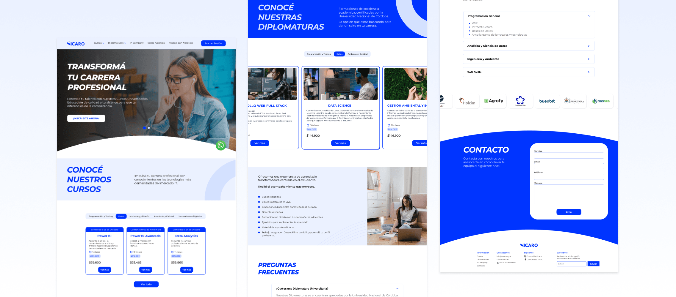
FINAL OUTCOME
FINAL OUTCOME
FINAL OUTCOME
The final version of the ICARO website brings together all the research insights, structural improvements, and visual decisions made throughout the process.
The redesign delivers a more intuitive, trustworthy, and engaging experience—helping users understand the value of each course, explore content with ease, and navigate the platform confidently. It also reinforces ICARO’s academic credibility while maintaining a clear and modern visual identity.
KEY IMPROVEMENTS
KEY IMPROVEMENTS
KEY IMPROVEMENTS
To close the case study, I highlighted the three most impactful improvements made throughout the redesign. These changes were directly aligned with the user research findings and addressed the most critical usability and trust issues of the previous site—making the new experience more intuitive, informative, and user-centered.
To close the case study, I highlighted the three most impactful improvements made throughout the redesign. These changes were directly aligned with the user research findings and addressed the most critical usability and trust issues of the previous site—making the new experience more intuitive, informative, and user-centered.
To close the case study, I highlighted the three most impactful improvements made throughout the redesign. These changes were directly aligned with the user research findings and addressed the most critical usability and trust issues of the previous site—making the new experience more intuitive, informative, and user-centered.
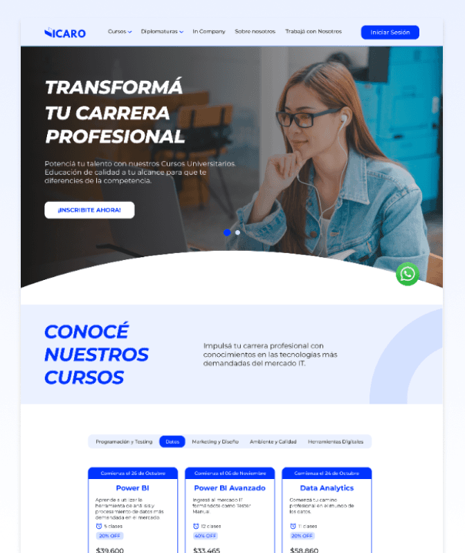
#1 CLARITY AND FOCUS IN THE HOMEPAGE
#1 CLARITY AND FOCUS IN THE HOMEPAGE
#1 CLARITY AND FOCUS IN THE HOMEPAGE
PROBLEM
PROBLEM
PROBLEM
The old homepage lacked visual hierarchy and overwhelmed users with dense blocks of text and little scannability. Key value propositions were hard to identify at a glance, and there was no clear next step for new visitors.
The old homepage lacked visual hierarchy and overwhelmed users with dense blocks of text and little scannability. Key value propositions were hard to identify at a glance, and there was no clear next step for new visitors.
SOLUTION
SOLUTION
SOLUTION
The redesigned homepage introduces visual structure through grid-based layout, clear headings, and iconography. Core benefits and actions are presented early, guiding users toward course discovery or enrollment with ease.
The redesigned homepage introduces visual structure through grid-based layout, clear headings, and iconography. Core benefits and actions are presented early, guiding users toward course discovery or enrollment with ease.
The redesigned homepage introduces visual structure through grid-based layout, clear headings, and iconography. Core benefits and actions are presented early, guiding users toward course discovery or enrollment with ease.
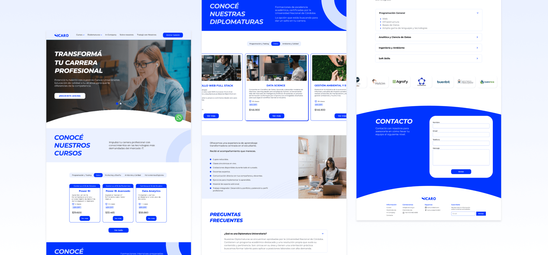
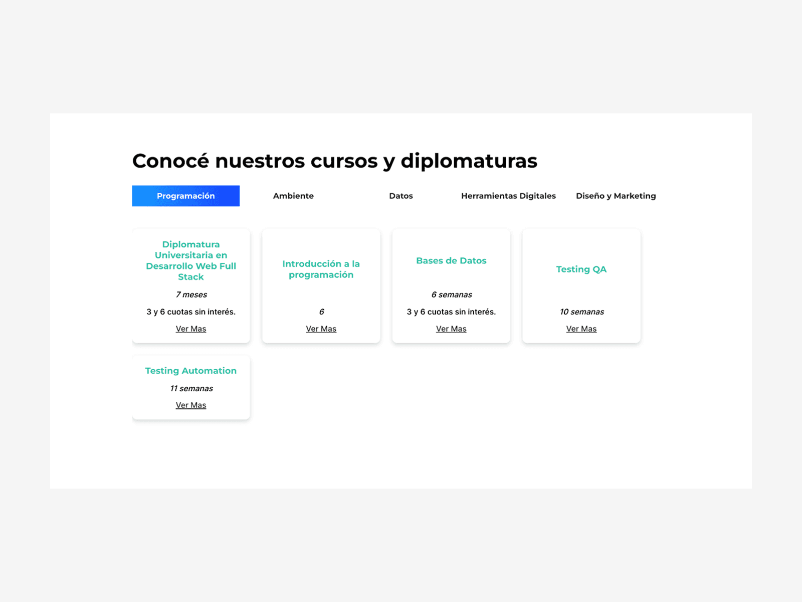
#2 IMPROVED COURSE DISCOVERY EXPERIENCE
#2 IMPROVED COURSE DISCOVERY EXPERIENCE
#2 IMPROVED COURSE DISCOVERY EXPERIENCE
PROBLEM
PROBLEM
PROBLEM
In the original site, course listings were displayed with minimal information, lacking filters or differentiation. Users couldn’t easily compare options or find relevant paths.
In the original site, course listings were displayed with minimal information, lacking filters or differentiation. Users couldn’t easily compare options or find relevant paths.
SOLUTION
SOLUTION
SOLUTION
The new platform organizes courses by category, adds key info like duration and price, and uses visual cards to simplify comparison—helping users choose with clarity.
The new platform organizes courses by category, adds key info like duration and price, and uses visual cards to simplify comparison—helping users choose with clarity.
The new platform organizes courses by category, adds key info like duration and price, and uses visual cards to simplify comparison—helping users choose with clarity.

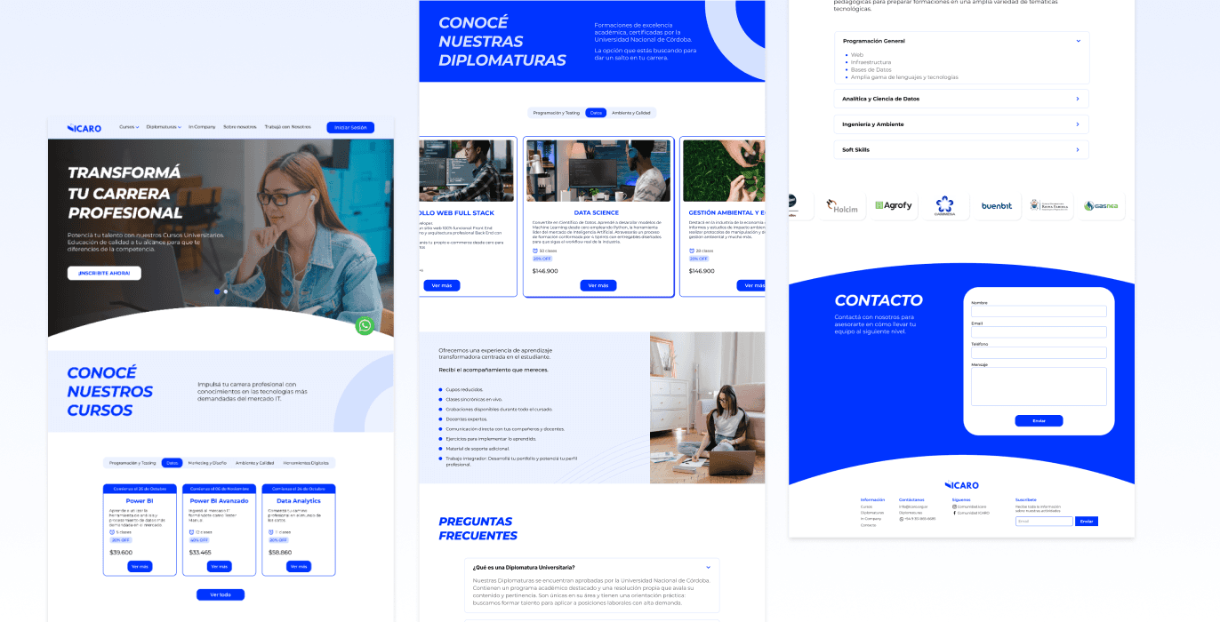
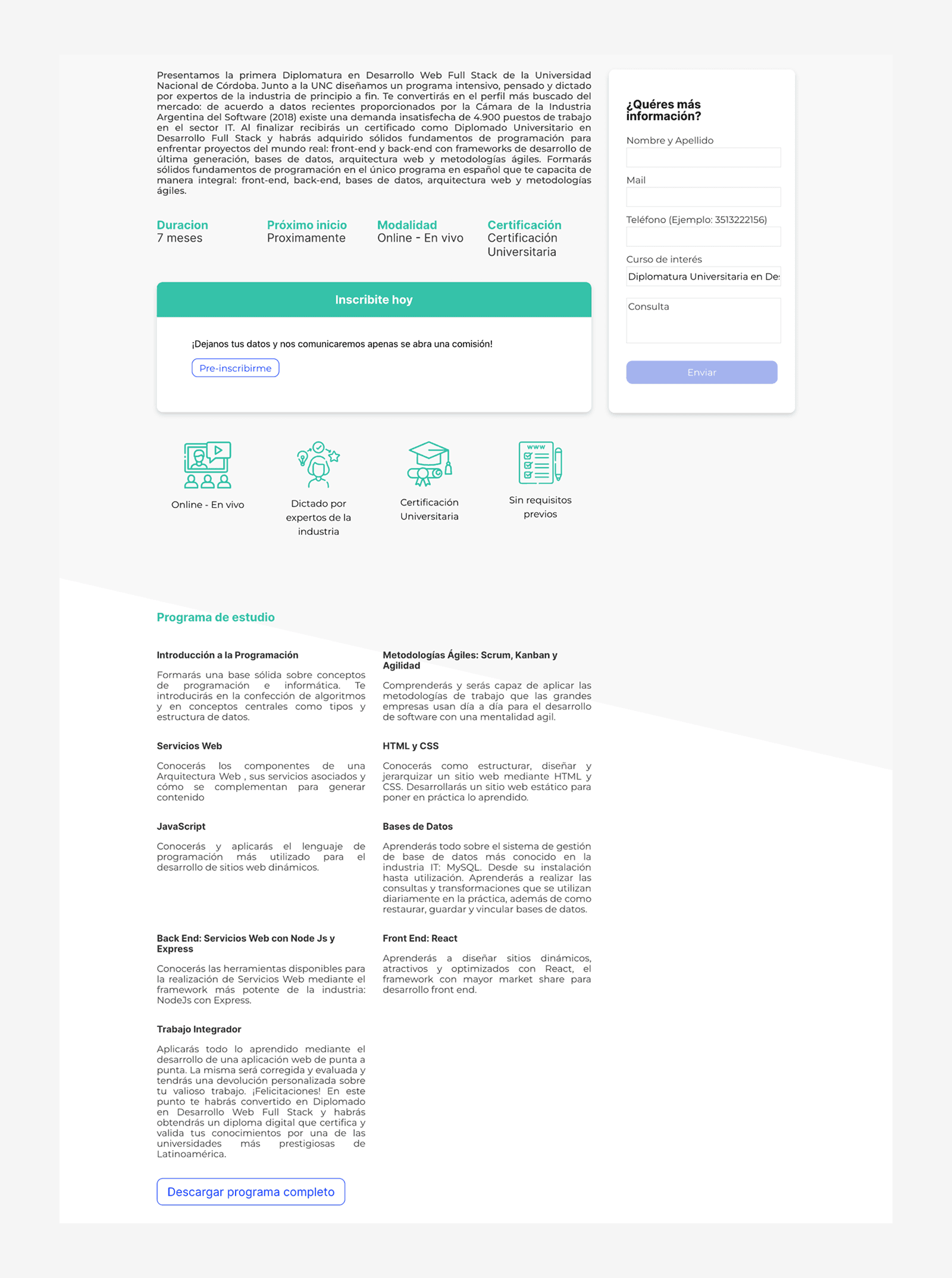
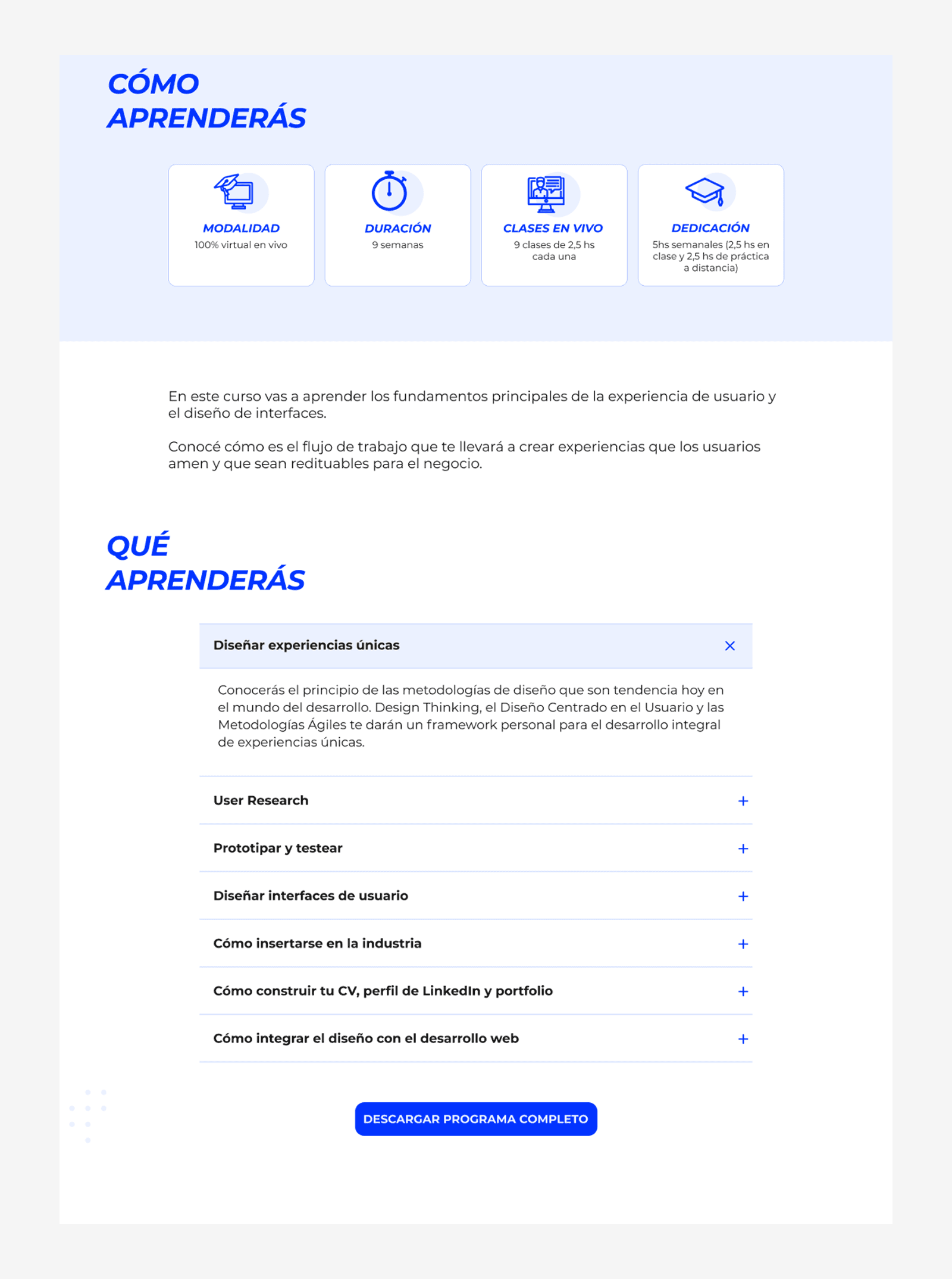
#3 CONTENT STRUCTURE IN COURSE DETAIL PAGES
#3 CONTENT STRUCTURE IN COURSE DETAIL PAGES
#3 CONTENT STRUCTURE IN COURSE DETAIL PAGES
PROBLEM
PROBLEM
PROBLEM
Course detail pages were unstructured and lacked trust-building elements. Users didn’t know what they’d learn, how long it would take, or what value the course offered—making enrollment risky.
Course detail pages were unstructured and lacked trust-building elements. Users didn’t know what they’d learn, how long it would take, or what value the course offered—making enrollment risky.
SOLUTION
SOLUTION
SOLUTION
The new layout improves clarity and trust. It highlights key outcomes, schedules, and benefits—all organized with clear hierarchy and expandable sections to support informed decisions.
The new layout improves clarity and trust. It highlights key outcomes, schedules, and benefits—all organized with clear hierarchy and expandable sections to support informed decisions.
CONCLUSION
CONCLUSION
CONCLUSION
This redesign helped ICARO communicate its value more clearly and offer a smoother, more confident user experience. From structure to visuals, every change aimed to remove friction and guide users with clarity and trust.
Each step of the process taught me to simplify without losing meaning — turning insights into action and always designing with real users in mind.