Carrefour
Carrefour
Enhancing clarity and usability in a major e-commerce platform
Enhancing clarity and usability in a major e-commerce platform
CONTEXT
CONTEXT
Personal Project
Personal Project
PROJECT DURATION
PROJECT DURATION
10 weeks · 2023
10 weeks · 2023
ROLE
ROLE
UX Research
UX Research
UX/UI Design
UX/UI Design
TOOLS
TOOLS
Figma
Figma
Photoshop
Photoshop
Miro
Miro
Optimal Workshop
Optimal Workshop
PROBLEM
PROBLEM
Carrefour is one of the largest supermarket chains in Latin America. As its e-commerce platform grew in popularity, users began facing increasing frustration: the interface was cluttered, navigation was confusing, and it was difficult to locate and compare products efficiently.
Carrefour is one of the largest supermarket chains in Latin America. As its e-commerce platform grew in popularity, users began facing increasing frustration: the interface was cluttered, navigation was confusing, and it was difficult to locate and compare products efficiently.
MY ROLE
MY ROLE
As the UX/UI designer, I conducted a full experience audit to identify friction points in the shopping journey. I reorganized the information structure and proposed a more intuitive interface aimed at guiding users smoothly from product search to checkout. I validated decisions through research and usability insights.
As the UX/UI designer, I conducted a full experience audit to identify friction points in the shopping journey. I reorganized the information structure and proposed a more intuitive interface aimed at guiding users smoothly from product search to checkout. I validated decisions through research and usability insights.
As the UX/UI designer, I conducted a full experience audit to identify friction points in the shopping journey. I reorganized the information structure and proposed a more intuitive interface aimed at guiding users smoothly from product search to checkout. I validated decisions through research and usability insights.
THE CHALLENGE
THE CHALLENGE
Despite strong brand recognition, the platform didn’t deliver a seamless experience. The overwhelming menu, lack of product clarity, and inefficient layout led to hesitation, high bounce rates, and dropped purchases.
Despite strong brand recognition, the platform didn’t deliver a seamless experience. The overwhelming menu, lack of product clarity, and inefficient layout led to hesitation, high bounce rates, and dropped purchases.
🔍 How might we…
Redesign Carrefour’s website to help users browse, compare, and complete their grocery shopping with ease — without getting lost in the process?
Redesign Carrefour’s website to help users browse, compare, and complete their grocery shopping with ease — without getting lost in the process?
Redesign Carrefour’s website to help users browse, compare, and complete their grocery shopping with ease — without getting lost in the process?
PRELIMINARY RESEARCH
PRELIMINARY RESEARCH
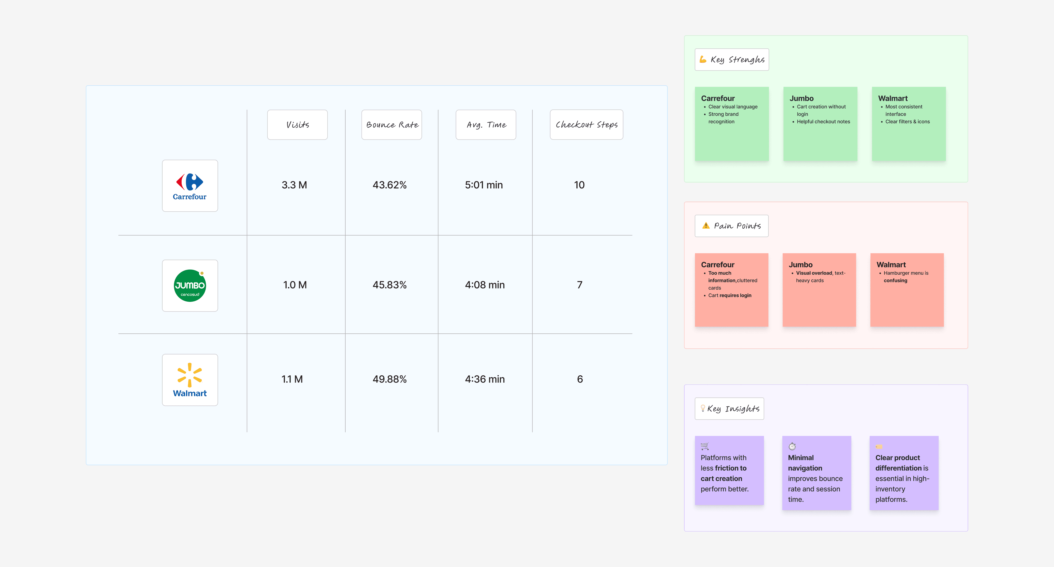
As a starting point, I analyzed the current performance of Carrefour’s website and uncovered key behavioral data:
• 3.3M monthly visits
• 43.6% bounce rate
• 6.73 pages per session
• 5:01 min average session duration
These numbers raised important questions:
• Why are users leaving before completing a purchase?
• What’s making product discovery confusing?
• How can we simplify the process and build trust?
To explore these questions, I applied a mixed-method approach combining:
• 🔍 UX Audit
• 📊 User surveys (10 participants)
• 🧭 Heuristic evaluation
• 🆚 Benchmark analysis (Jumbo & Walmart)
BENCHMARK ANALYSIS
BENCHMARK ANALYSIS
To better understand Carrefour’s strengths and weaknesses, I analyzed two local competitors: Jumbo and Walmart. I focused on product browsing, checkout flows, interface clarity, and overall shopping experience.
To better understand Carrefour’s strengths and weaknesses, I analyzed two local competitors: Jumbo and Walmart. I focused on product browsing, checkout flows, interface clarity, and overall shopping experience.
Numbers reveal patterns, but only users can tell us what truly works — or doesn’t. I reached out to them to uncover their real thoughts, frustrations, and motivations when shopping on the platform.
Numbers reveal patterns, but only users can tell us what truly works — or doesn’t. I reached out to them to uncover their real thoughts, frustrations, and motivations when shopping on the platform.
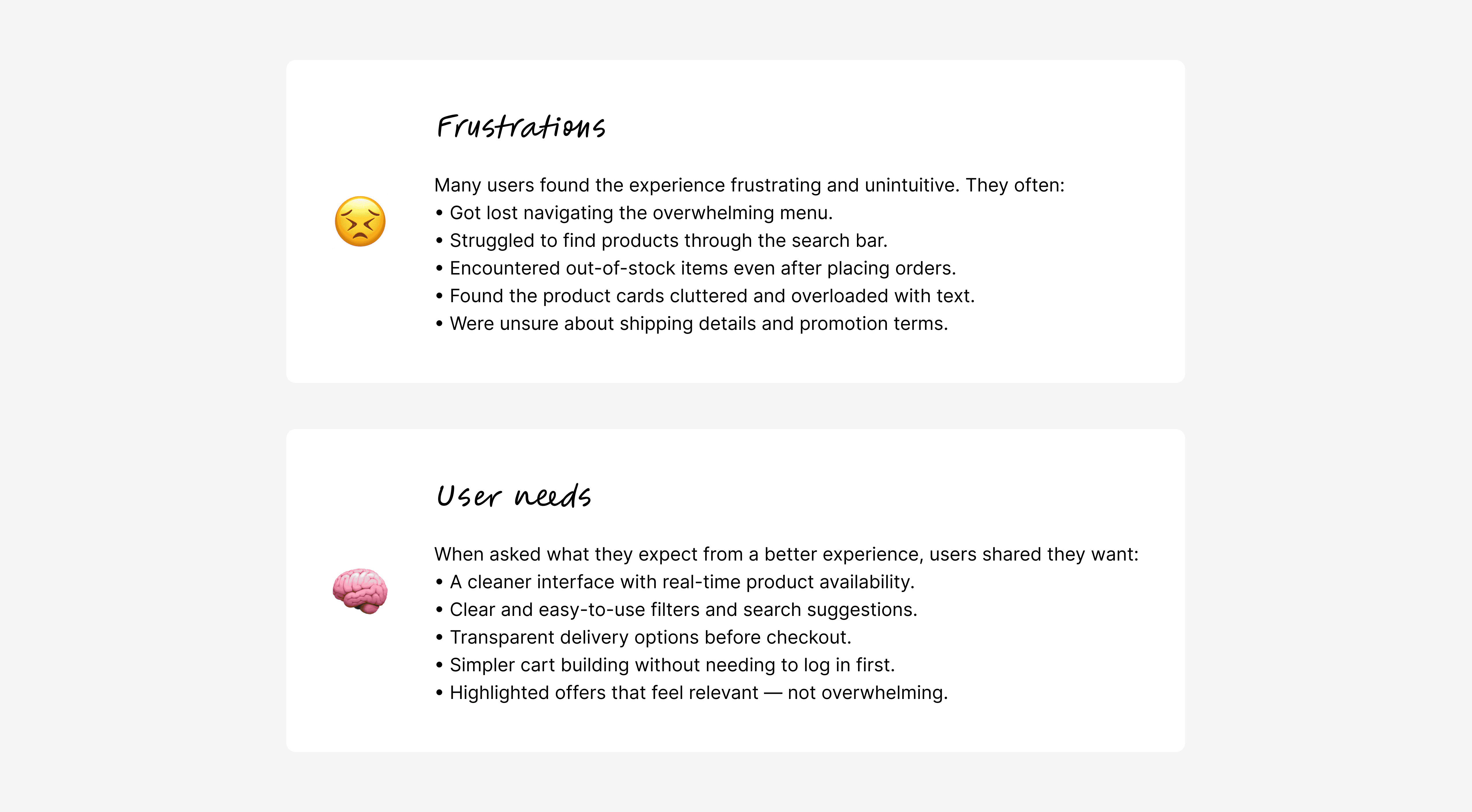
USER INSIGHTS
To better understand user behavior and expectations, I conducted surveys and gathered feedback from frequent Carrefour users. The goal was to uncover pain points, motivations, and improvement opportunities that could inform key design decisions.
60%
60%
say the site is easy to use
say the site is easy to use
70%
70%
struggled to learn how to use it due to clutter
struggled to learn how to use it due to clutter
struggled to learn how to use it due to clutter
80%
80%
would recommend the platform
would recommend the platform
60%
60%
tried using another similar platform
tried using another similar platform
USER PERSPECTIVE
USER PERSPECTIVE
To dive deeper into user behavior, I asked frequent customers about what they found most frustrating — and what they would love to see improved. Their feedback helped surface usability pain points and unmet needs, giving clear direction for experience-focused enhancements.
To dive deeper into user behavior, I asked frequent customers about what they found most frustrating — and what they would love to see improved. Their feedback helped surface usability pain points and unmet needs, giving clear direction for experience-focused enhancements.
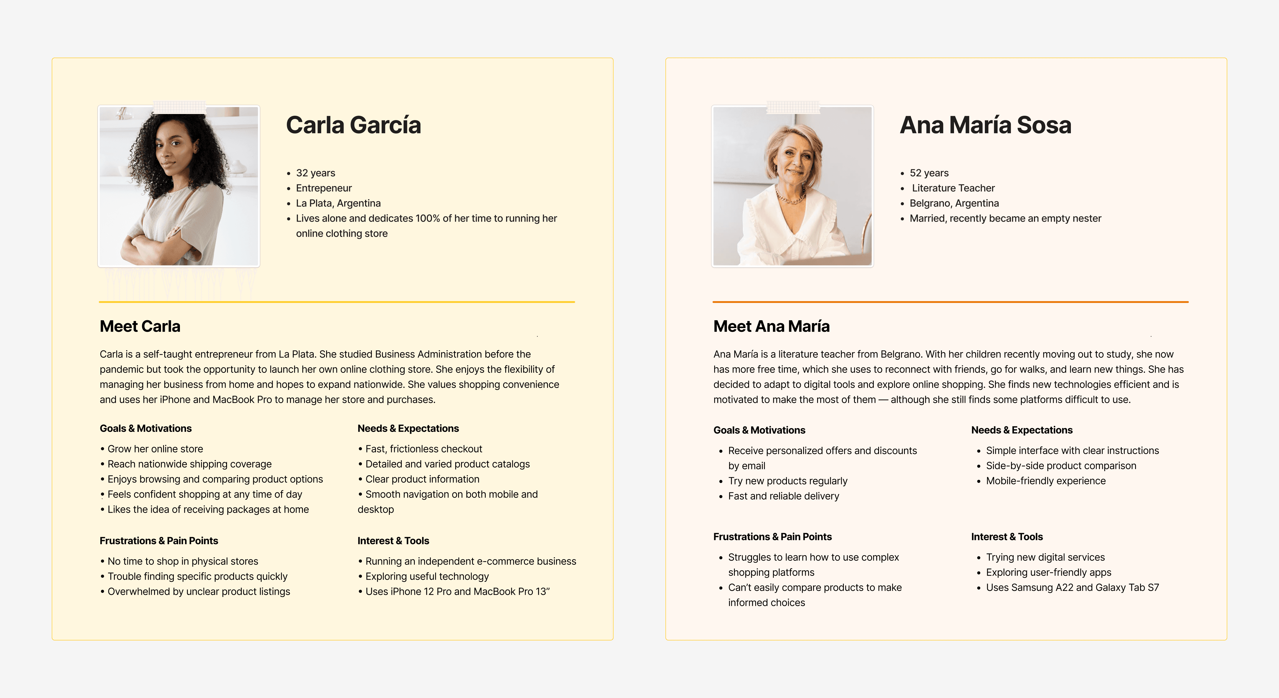
USER PERSONA
USER PERSONA
To better understand user goals, challenges, and behaviors, I created detailed user personas based on survey data and user interviews. These profiles helped guide design decisions and keep user needs at the center of the process.
To better understand user goals, challenges, and behaviors, I created detailed user personas based on survey data and user interviews. These profiles helped guide design decisions and keep user needs at the center of the process.

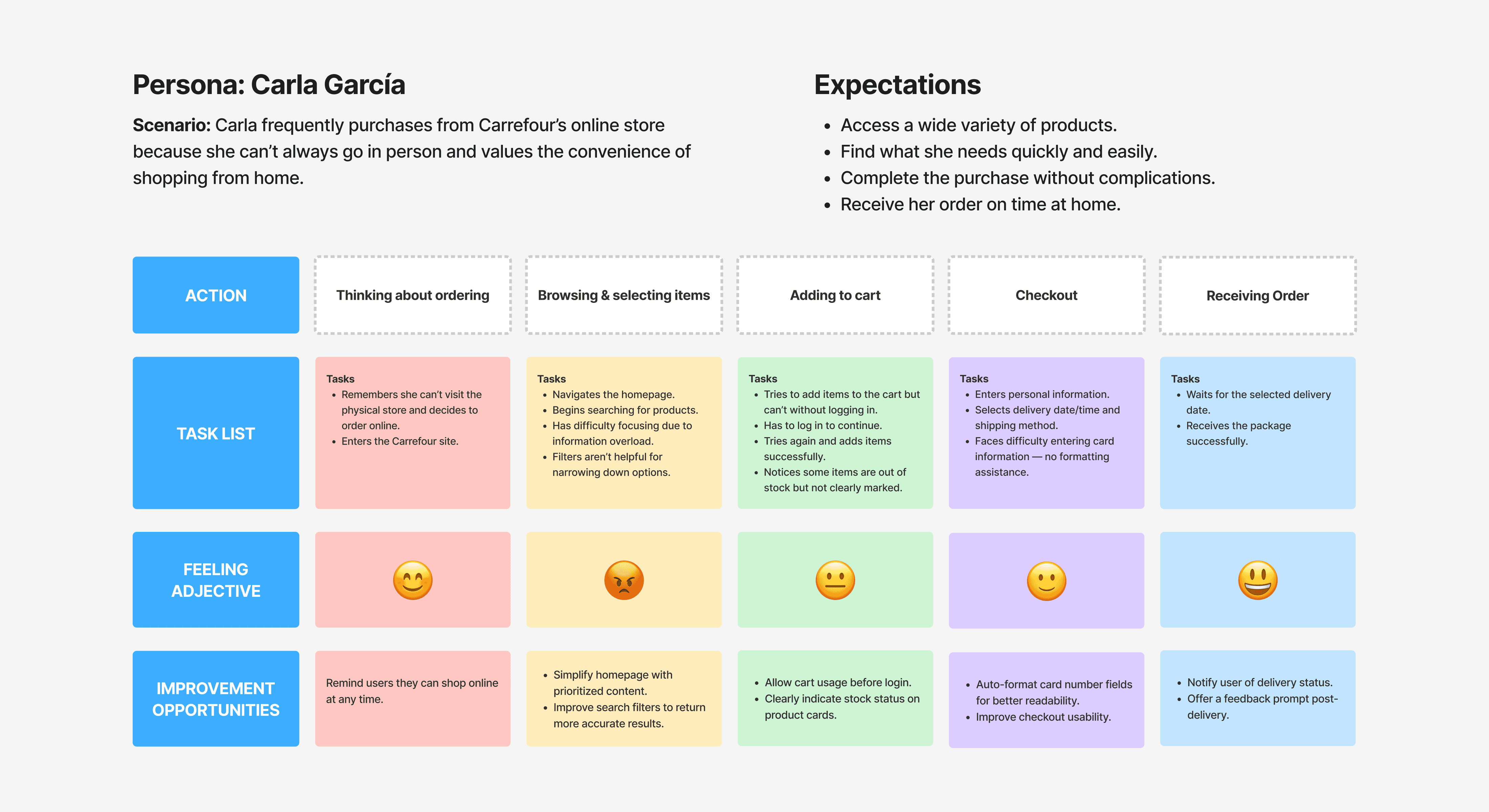
USER JOURNEY
USER JOURNEY
To better understand Carla’s experience using Carrefour’s online store, I mapped out her end-to-end journey — from the moment she decides to order until the product is delivered.
This helped identify emotional highs and lows, pain points, and improvement opportunities across every stage, supporting experience-driven design decisions.
INFORMATION ARCHITECTURE EVALUATION
To understand how users interact with Carrefour’s current structure, I conducted a tree testing activity. This technique allowed me to evaluate how easily users could locate specific content based solely on the site’s navigation labels—without visual aids.
The goal was to detect structural confusion, miscategorized content, and opportunities to improve the site’s overall findability and logic.
EVALUATING THE CURRENT STRUCTURE
EVALUATING THE CURRENT STRUCTURE
To assess how intuitive the existing information architecture was for users, I conducted a tree testing exercise. The goal was to understand how easily users could locate specific content within the site’s current structure.
Below are two tasks given to participants, along with their performance results and key insights.
TASK #1
TASK #1
Scenario:
You’re lying on the couch and craving a pudding, but don’t feel like cooking. You enter the Carrefour site to check what pudding options are available.
Question: In which category would you expect to find them?
Results & Insights:
0% of users completed the task successfully.
56% reached the correct category indirectly.
6 out of 9 users preferred using the search bar without filters.
→ Category names were unclear and did not ensure users knew where to look.
Average time: 24.99s (min: 12.52s, max: 101.17s)
Main pain point: Users associated pudding with “Pantry” or “Bakery” — but it was under “Breakfast & Snacks.”
Conclusion: Users didn’t associate the product with time-of-day but with its type. Categorization should reflect that to speed up discovery.
TASK #2
TASK #2
Scenario:
You received your credit card statement and noticed a mistake in one of your purchases. You enter the site to verify the transaction.
Question: Where would you expect to find this information?
Results & Insights:
56% of users completed the task successfully.
67% clicked first on “My Account.”
Average time: 15.12s (min: 4.01s, max: 84.04s)
Issue detected: Users were confused between “Orders” and “Receipts” subcategories.
Conclusion: Both should be merged or clearly grouped under the same section since they contain related information.
CONCLUSIONS
CONCLUSIONS
Both tasks revealed significant usability gaps in the current structure. Users struggled with unclear category labels and overlapping subcategories, which hindered their ability to find content efficiently. Even when participants reached the correct destination, it was often through trial and error. This highlights the need for a clearer, more intuitive categorization system that aligns with users’ mental models and expectations.
Both tasks revealed significant usability gaps in the current structure. Users struggled with unclear category labels and overlapping subcategories, which hindered their ability to find content efficiently. Even when participants reached the correct destination, it was often through trial and error. This highlights the need for a clearer, more intuitive categorization system that aligns with users’ mental models and expectations.
UPDATED INFORMATION ARCHITECTURE
UPDATED INFORMATION ARCHITECTURE
After analyzing the results of the initial tree testing, I redesigned the site’s information architecture to address the main usability issues. The new structure focuses on improving clarity, simplifying navigation, and grouping related content more intuitively.
After analyzing the results of the initial tree testing, I redesigned the site’s information architecture to address the main usability issues. The new structure focuses on improving clarity, simplifying navigation, and grouping related content more intuitively.
RE-EVALUATING WITH THE SAME TASKS
RE-EVALUATING WITH THE SAME TASKS
To validate the effectiveness of the updated structure, I ran the same two tasks with a new group of users. This allowed me to compare performance and identify whether the changes improved navigation and content discoverability.
To validate the effectiveness of the updated structure, I ran the same two tasks with a new group of users. This allowed me to compare performance and identify whether the changes improved navigation and content discoverability.
TASK #1
TASK #1
Scenario:
Same scenario as before: users had to find the category where pudding would be listed.
Results & Insights:
60% of participants clicked first on the “Menu” category.
6 out of 10 correctly selected “Pantry” as the subcategory.
Remaining participants went to “Offers”, “How to buy”, or “Promotions”, and did not complete the task.
Average time: 20.33s (min: 6.72s, max: 66.85s)
Conclusion: Users no longer hesitated between multiple categories. “Pantry” appeared as a more intuitive choice.
TASK #2
TASK #2
Scenario:
Same scenario as before: users had to verify a transaction through their account section.
Results & Insights:
80% of participants clicked first on “My Account”.
9 out of 10 correctly selected “Orders” to verify the information.
Average time: 25.25s (min: 3.11s, max: 35.34s)
Conclusion: Grouping all purchase-related information under a single, clear label reduced confusion and improved task success.
CONCLUSIONS
CONCLUSIONS
The updated structure successfully improved users’ ability to find the correct information. Clearer naming and logical grouping helped reduce errors and shortened task completion times. Overall, users showed greater confidence and fluency in navigation.
The updated structure successfully improved users’ ability to find the correct information. Clearer naming and logical grouping helped reduce errors and shortened task completion times. Overall, users showed greater confidence and fluency in navigation.
FINAL ITERATION - REFINED ARCHITECTURE
FINAL ITERATION - REFINED ARCHITECTURE
After reviewing the second round of testing, I introduced further improvements to simplify the site even more. The product section was given greater visual hierarchy, and less critical items were relocated to a secondary menu. This final version will be used for the upcoming usability tests and wireframing phase.
After reviewing the second round of testing, I introduced further improvements to simplify the site even more. The product section was given greater visual hierarchy, and less critical items were relocated to a secondary menu. This final version will be used for the upcoming usability tests and wireframing phase.
FINAL THOUGHTS
FINAL THOUGHTS
This refined architecture is more user-centered, reducing friction during the purchase journey and making it easier for users to locate what they’re looking for. By aligning structure with user expectations, the foundation is now set for designing a more intuitive and efficient digital experience.
This refined architecture is more user-centered, reducing friction during the purchase journey and making it easier for users to locate what they’re looking for. By aligning structure with user expectations, the foundation is now set for designing a more intuitive and efficient digital experience.
NEXT STEPS - FROM PRIORITIES TO PROTOTYPES
NEXT STEPS - FROM PRIORITIES TO PROTOTYPES
Based on this prioritization, I selected the most impactful and feasible improvements to begin shaping into low-fidelity wireframes. These design solutions aim to address users’ pain points and enhance the overall shopping experience.
Based on this prioritization, I selected the most impactful and feasible improvements to begin shaping into low-fidelity wireframes. These design solutions aim to address users’ pain points and enhance the overall shopping experience.
WIREFRAMES AND LAYOUT PROPOSALS
WIREFRAMES AND LAYOUT PROPOSALS
Before moving forward with the visual design, I explored different layout proposals through low-fidelity wireframes. These helped me organize content hierarchy, define navigation patterns, and rethink how users access and interact with key sections. Below is a comparison between the original site and the new wireframe suggestions.
Before moving forward with the visual design, I explored different layout proposals through low-fidelity wireframes. These helped me organize content hierarchy, define navigation patterns, and rethink how users access and interact with key sections. Below is a comparison between the original site and the new wireframe suggestions.
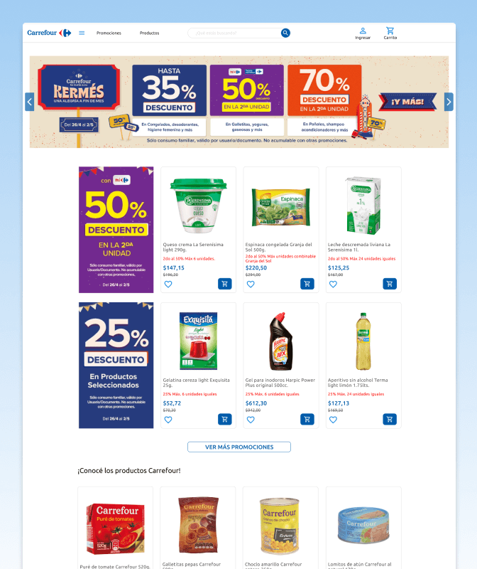
#1 HIGHLIGHTING PROMOTIONS IN A CLEANER HOMEPAGE
#1 HIGHLIGHTING PROMOTIONS IN A CLEANER HOMEPAGE
The homepage was overloaded with large banners that competed for attention and lacked visual hierarchy. In this new proposal, I reorganized the navigation bar and prioritized a featured promotion section with less visual noise. This allowed for a cleaner and more scannable first impression, helping users quickly find relevant content.
The homepage was overloaded with large banners that competed for attention and lacked visual hierarchy. In this new proposal, I reorganized the navigation bar and prioritized a featured promotion section with less visual noise. This allowed for a cleaner and more scannable first impression, helping users quickly find relevant content.
CURRENT
CURRENT
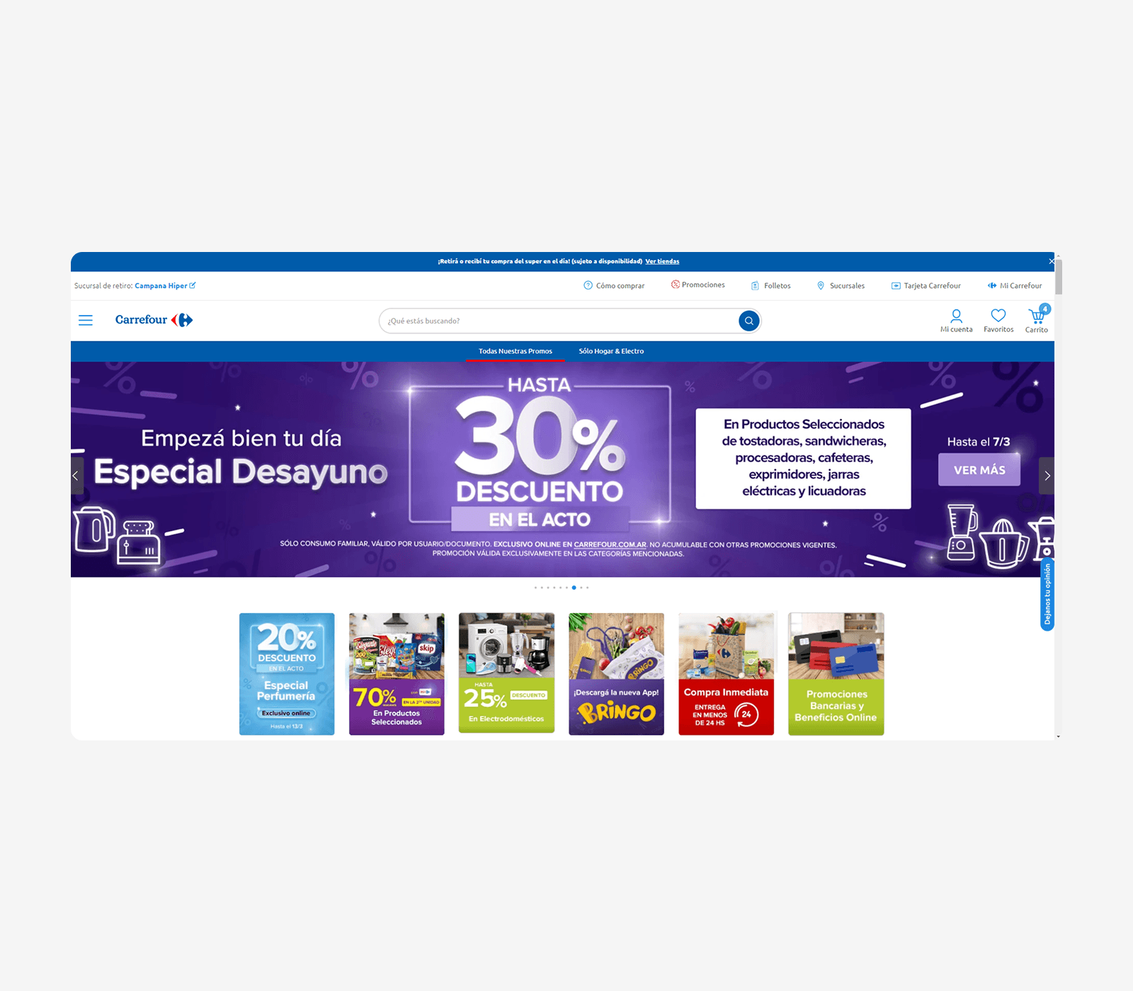
PROPOSED
PROPOSED
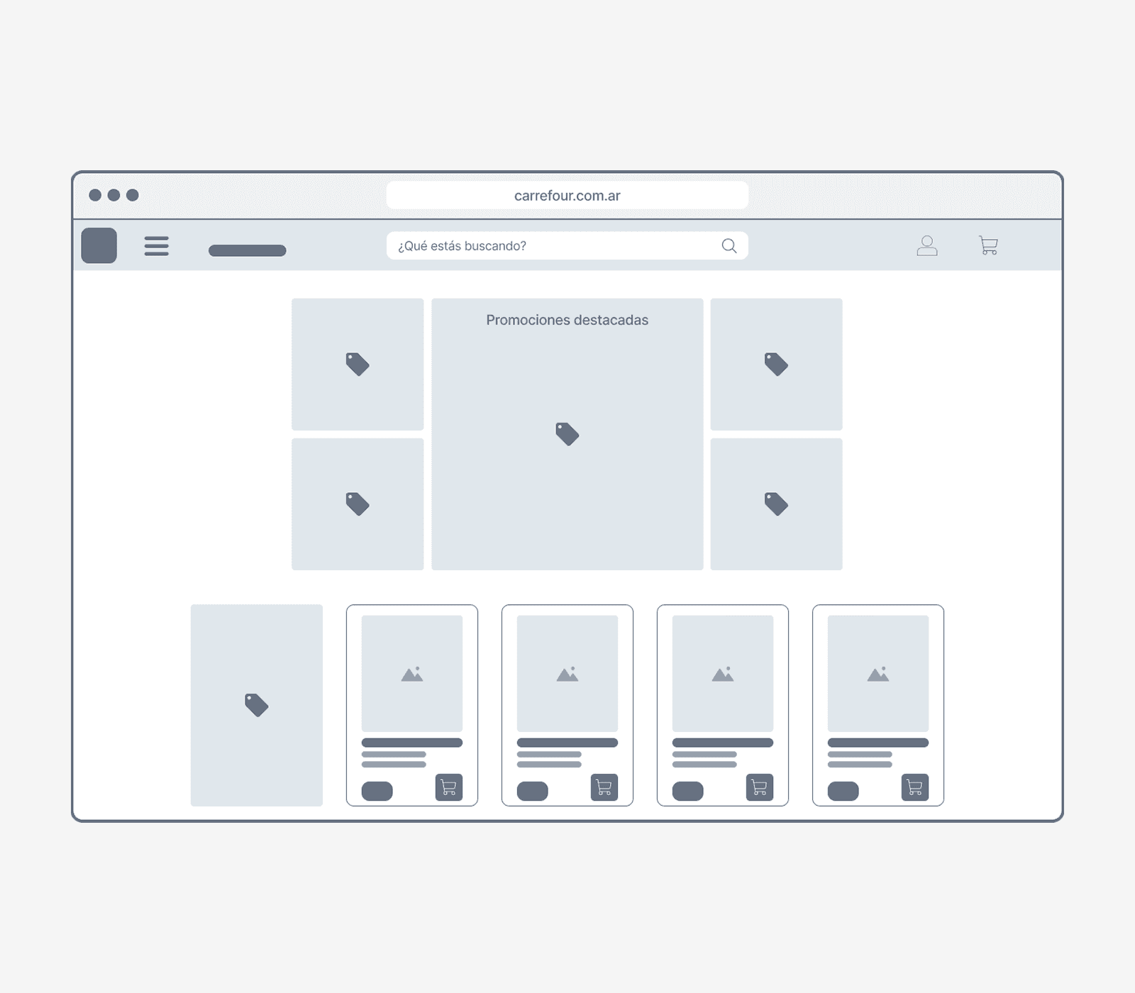
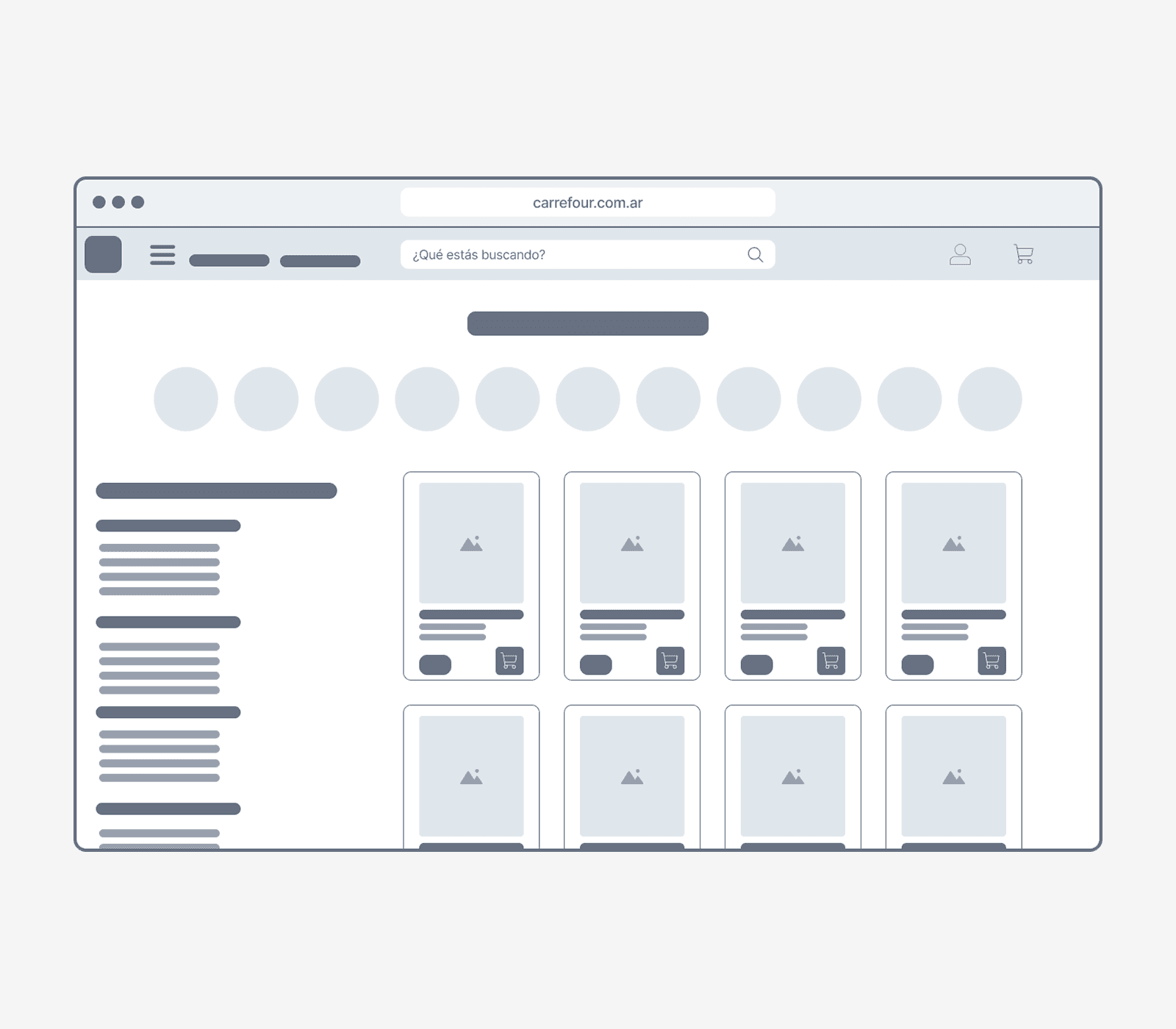
#2 STRUCTURING THE PRODUCT BROWSING EXPERIENCE
#2 STRUCTURING THE PRODUCT BROWSING EXPERIENCE
The original site didn’t offer a dedicated section for browsing products. Instead, users had to interact with a dense and hard-to-read menu. This new layout introduces a dedicated product section where users can browse categories freely, in a more intuitive and accessible way, without needing to navigate a dropdown multiple times.
The original site didn’t offer a dedicated section for browsing products. Instead, users had to interact with a dense and hard-to-read menu. This new layout introduces a dedicated product section where users can browse categories freely, in a more intuitive and accessible way, without needing to navigate a dropdown multiple times.
CURRENT
CURRENT
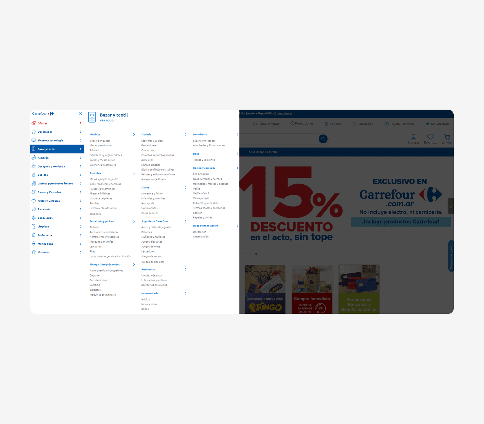
PROPOSED
PROPOSED
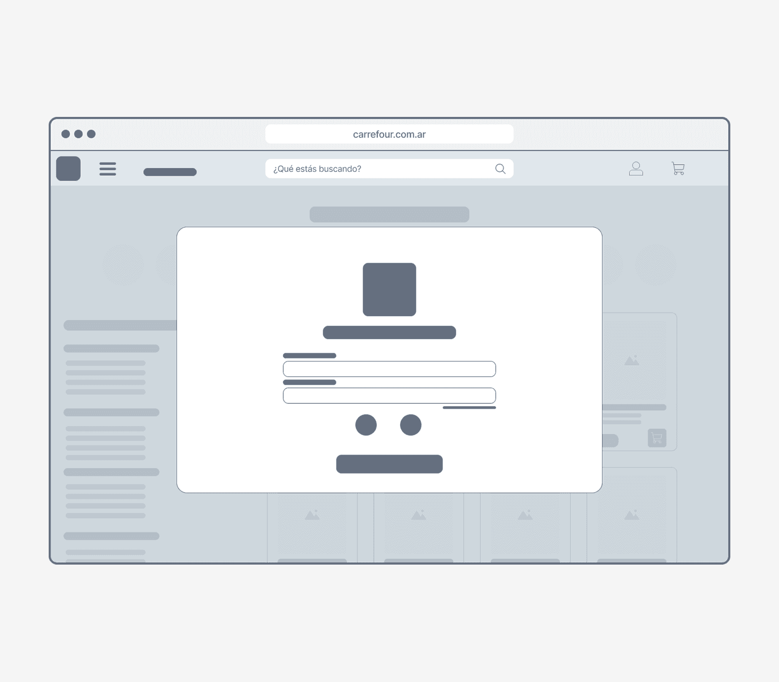
#3 IMPROVING ACCESS AND REGISTRATION FLOW
#3 IMPROVING ACCESS AND REGISTRATION FLOW
Although the current login screen is simple, I proposed a larger modal with clearer options to log in via social networks. Most importantly, this new flow removes the barrier of needing to log in to start adding items to the cart — improving usability and reducing friction in the purchase process.
Although the current login screen is simple, I proposed a larger modal with clearer options to log in via social networks. Most importantly, this new flow removes the barrier of needing to log in to start adding items to the cart — improving usability and reducing friction in the purchase process.
CURRENT
CURRENT
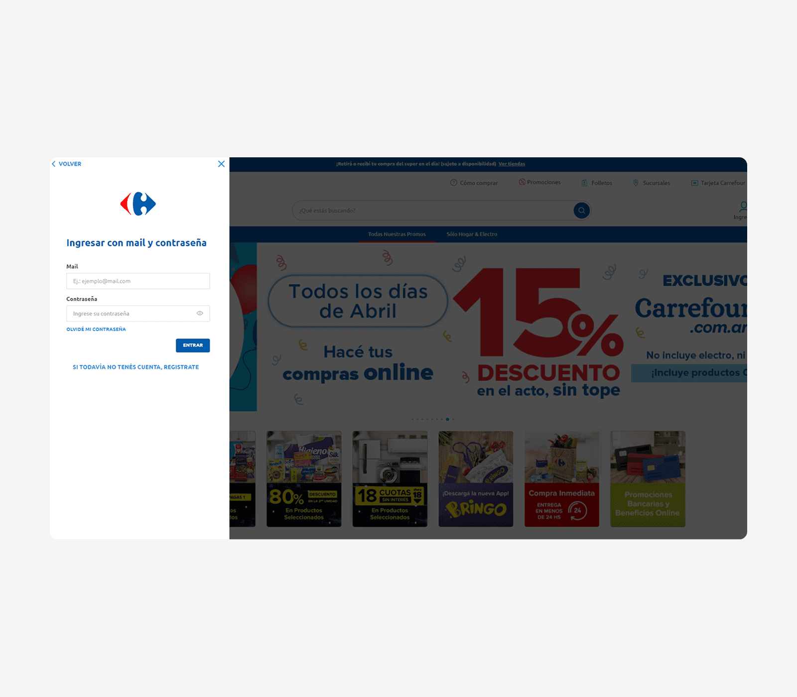
PROPOSED
PROPOSED
UI SYSTEM
UI SYSTEM
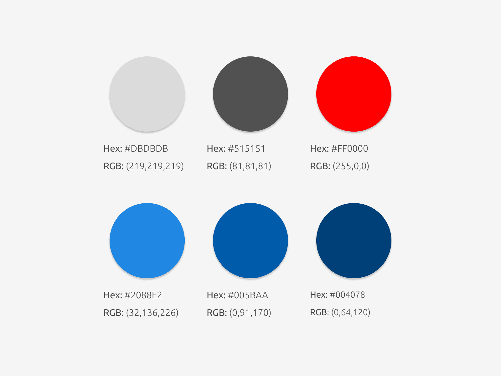
To maintain visual consistency throughout the interface, I created a UI system that organizes and applies Carrefour’s existing brand elements — including type, color, and visual components — in a cohesive and structured way. This system ensures a smooth, familiar experience for users, while improving usability and clarity across screens.
To maintain visual consistency throughout the interface, I created a UI system that organizes and applies Carrefour’s existing brand elements — including type, color, and visual components — in a cohesive and structured way. This system ensures a smooth, familiar experience for users, while improving usability and clarity across screens.
BRAND IDENTITY
BRAND IDENTITY
Rather than introducing a new identity, this project builds upon Carrefour’s current visual language. I used the existing typeface and color palette, applying them in a clean and accessible way across the layout. The goal was to preserve brand recognition while reinforcing a clear and intuitive design system that aligns with the needs of everyday shoppers.
Rather than introducing a new identity, this project builds upon Carrefour’s current visual language. I used the existing typeface and color palette, applying them in a clean and accessible way across the layout. The goal was to preserve brand recognition while reinforcing a clear and intuitive design system that aligns with the needs of everyday shoppers.
LAYOUT & COMPONENTS
LAYOUT & COMPONENTS
The design system includes a cohesive library of components built on a flexible grid. From product cards and buttons to form elements and navigation, each component was designed with usability and consistency in mind.
The design system includes a cohesive library of components built on a flexible grid. From product cards and buttons to form elements and navigation, each component was designed with usability and consistency in mind.

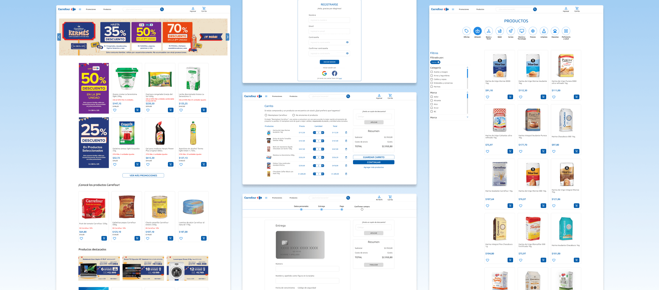
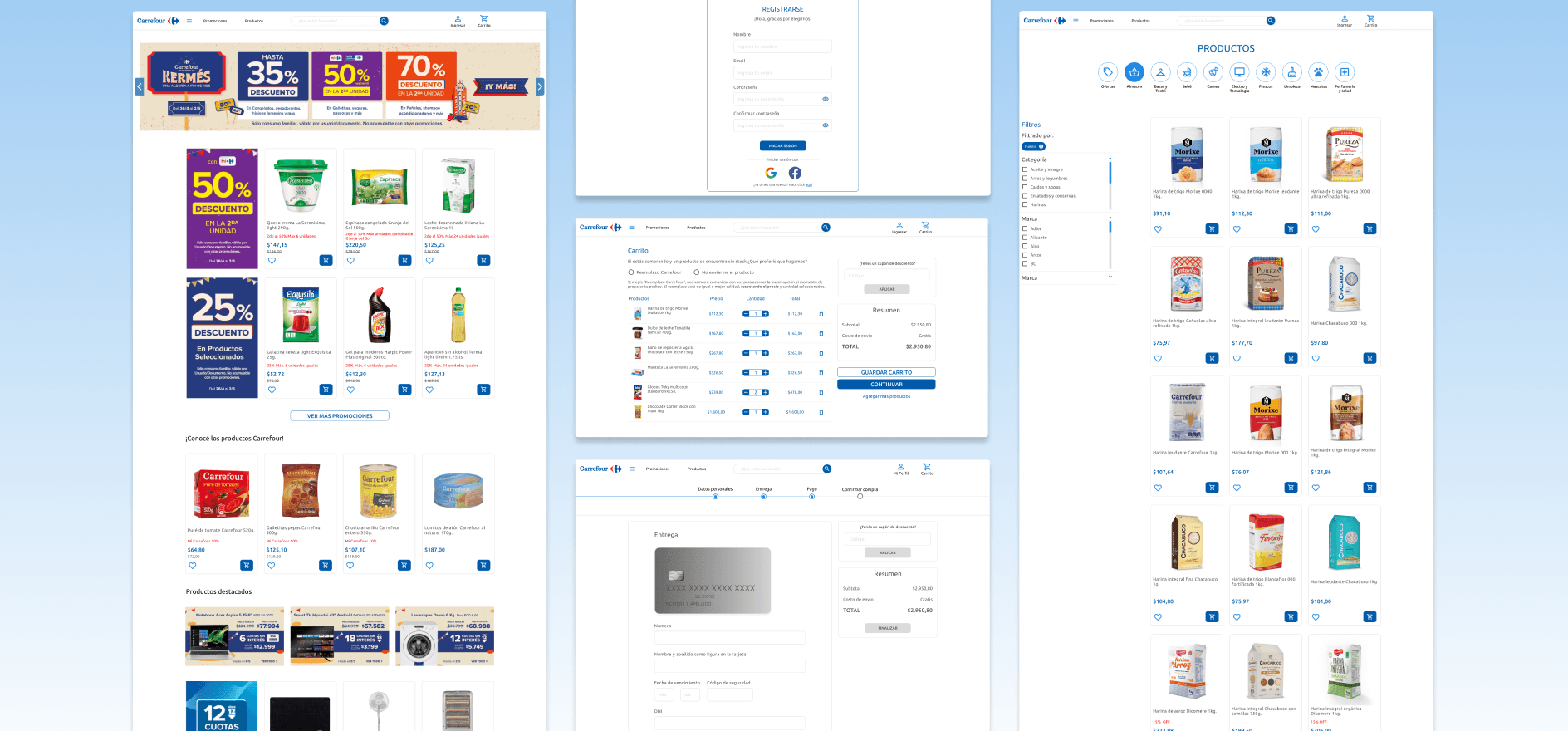
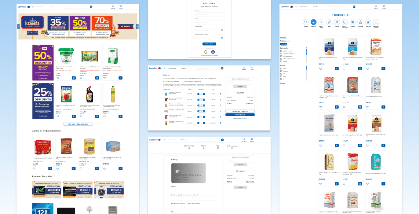
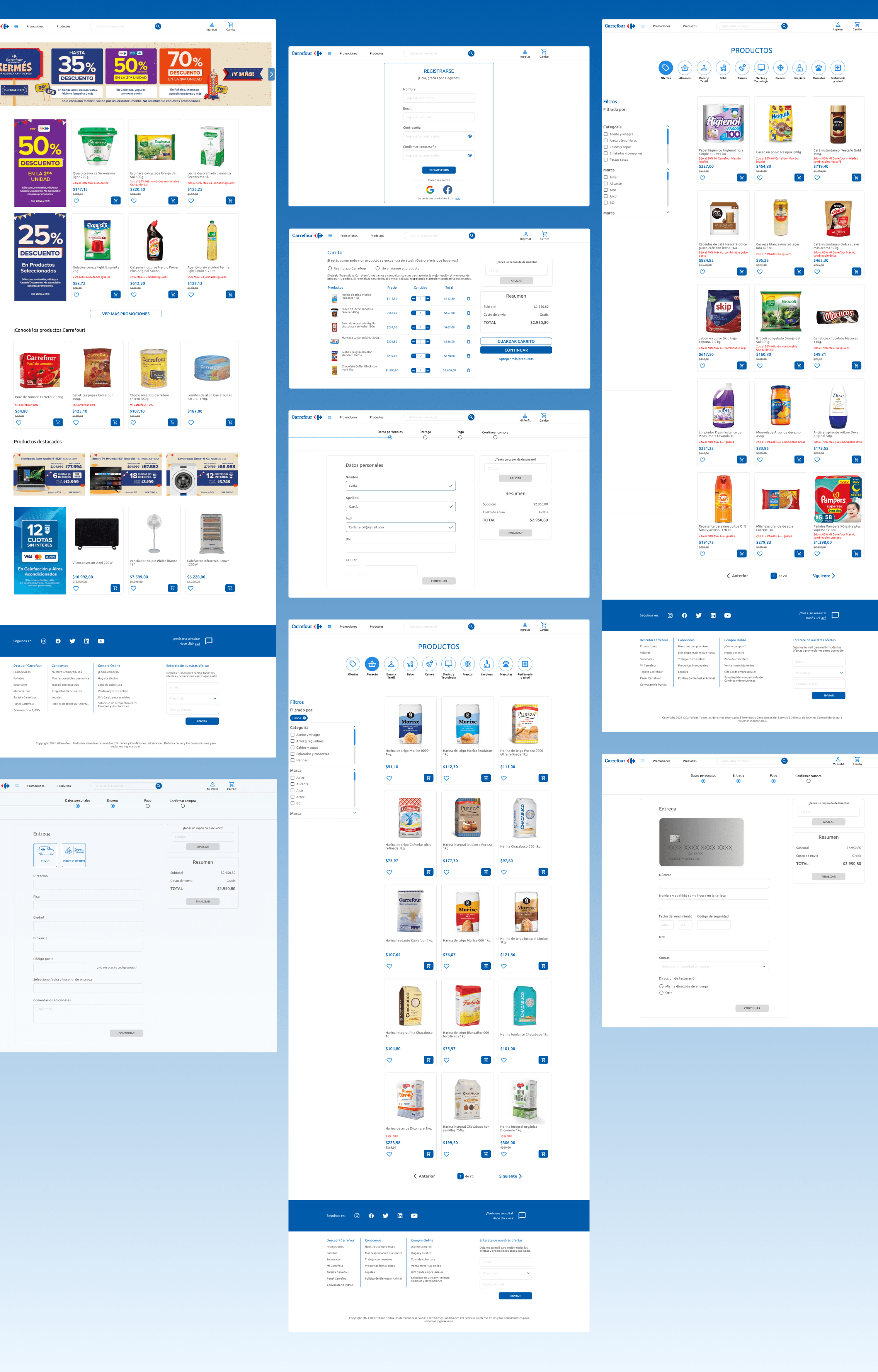
FINAL OUTCOME
FINAL OUTCOME
After iterating based on user feedback and usability tests, I developed the final high-fidelity interface. The new layout improves navigation, visual clarity, and task completion, offering users a smoother and more intuitive shopping experience.
After iterating based on user feedback and usability tests, I developed the final high-fidelity interface. The new layout improves navigation, visual clarity, and task completion, offering users a smoother and more intuitive shopping experience.
LEARNINGS & CONCLUSIONS
LEARNINGS & CONCLUSIONS
This project was a valuable opportunity to explore how thoughtful UX decisions can simplify complex interfaces and enhance usability. Through research, testing, and iterative design, I was able to identify key friction points in the user journey and propose solutions grounded in real user behavior.
Rather than focusing solely on visuals, the process prioritized structure, clarity, and user needs — from reorganizing the site’s architecture to optimizing navigation and category logic. The final outcome reflects a more intuitive, accessible experience that empowers users to shop more efficiently and confidently.
This project also reinforced the importance of aligning design with business goals while keeping the user at the center — a balance I always strive for in my work.